Best ways to visualise your data in Power BI
Best ways to visualise your data in Power BI
April 8th, 2023
12 min read
Power BI is Microsoft’s powerful data analytics tool and forms part of the Power Platform. Its clever capabilities allow even the most non-technical users in a company to gain intelligent insights into data, which can then be used to make more informed decisions. This tool connects hundreds of data sources and pulls them into visual, easy-to-read graphs and charts, with drill-down capabilities allowing you to interrogate data further than basic reporting functionality. In a world where data is becoming increasingly important, having the information without the right tools to make sense of it is almost pointless. The real value is being able to deep-dive into it, analyse the insights, then most importantly make strategic business decisions based on the findings. Within this blog, we highlight the best ways to visualise data within Power BI and provide an overview of the tool-tip functionality also available within the tool.
What is data visualisation and why is it important?
Data visualisation is the process of taking raw data and transforming it into a graphical representation such as live charts, graphs, diagrams, pictures, etc, which then explains the data and allows you to gain insights, analyse the findings and most importantly make more strategic decisions. The importance of data visualisation is inherent with the familiar saying “a picture speaks a thousand words” and provides an easy way of really understanding your business information. Ultimately, the end benefit of data visualisation is its ability to drive better decision-making. Here are a few ways data visualisation helps with strategic decision making:
- See the big picture: Notice trends and spot patterns you wouldn’t be able to see if you were looking at numbers on their own.
- Identify the significance: How is your business performing, what needs to be modified, and where should you focus your resources? The ability to understand the significance of your data drives more effective operations and decisions.
- Make informed decisions: With concrete numbers and tangible insights, you can be confident your decisions are backed by data. Having clear insight into performance metrics empowers you with the knowledge and arms you with the tools to make the right decisions at the right time.
- Track trends over time: Once you’ve established a baseline, trends will begin to emerge. Track progress, spot trends, and begin using your insights to drive informed, strategic decisions. As you build your trends, shifts in patterns indicate if things drift off track, allowing you to immediately address any sign of lowered performance.
There are plenty of visualisations available to choose from within Power BI, each of which serves a different purpose. Below, we look at a few of the common visualisation types…
Ways to visualise data
Power BI comes with many out-of-the-box Power BI visuals. These visuals are available in the visualization pane of both Power BI Desktop and Power BI Service, and can be used for creating and editing Power BI content. The full library of available visualisations can be found in the Microsoft Appstore, where there are over 300 visual types to choose from.
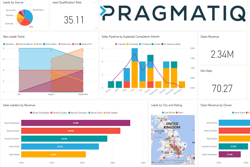
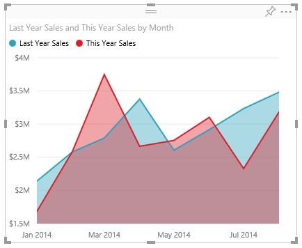
Area Charts
Area Charts in Power BI are also known as layered area charts and you can see why in the image below. The area between the line and axis is shaded with colour to indicate volume. An area chart is best used for monitoring total value across trends and comparing change. The use of this chart lends itself to comparing data as you can easily see peaks and troughs over time, layered to make it easier for a user. For example, the image below shows the comparison of yearly sales month by month, to emphasise total profit.
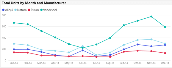
Line Charts
Line charts are one of the most-used and recognised charts to display data. The data points are connected by a straight line with each of the points in the line corresponding to a data value. Line charts are best used to measure trends over a period of time.
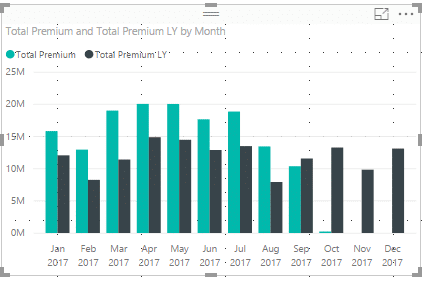
Bar Charts
Bar charts are a popular choice because they are simple to create and easy to interpret. Bar charts are useful when there is a need to display data that includes negative values as it is possible to position the bars below as well as above the x-axis.
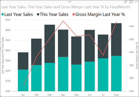
Combo Charts
Combo charts combine a line chart and a column chart to produce one single visualisation. This illustrates correlations between data and allows for the comparison between multiple data sets, allowing you to draw key insights quickly and see where improvements need to be made. An example of where a combo chart can be used is demonstrated below, where last year’s and this year’s sales are represented in bar columns, and the gross margin last year is represented by the line overlaying them.
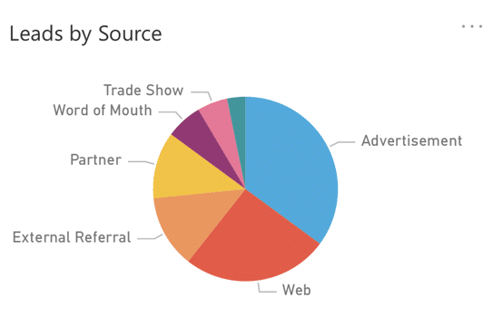
Pie Charts
The purpose of a Pie chart is to illustrate the contribution of different values to a total and are good for displaying data for around 10 categories or fewer. This visual type is widely used across industries as they enable users to quickly understand their data at a glance.
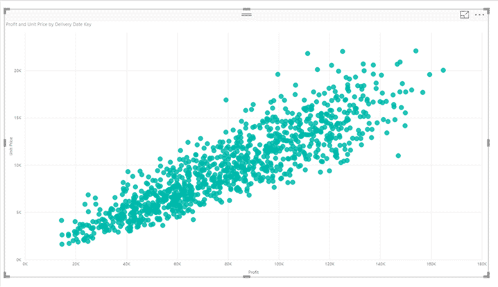
Scatter Charts
Scatter charts use dots to demonstrate the relationship between two different variables. It is also referred to as a correlation plot because it shows how two variables are correlated with each other.
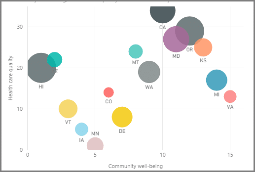
Bubble Charts
A bubble graph is used to visualize data set with three dimensions. It is quite similar to the Scatter chart, however, the scatter chart has two value axes – one numerical data long horizontal axis and one along the vertical axis, showing the relationship between the two numerical values. A bubble chart differs as it replaces the data points with a bubble size representing the third data dimension.
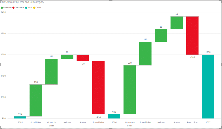
Waterfall Charts
Waterfall charts, also known as bridge charts, show a running total as values are added or subtracted. They are useful for understanding how an initial value (like net income) is affected by a series of positive and negative changes.
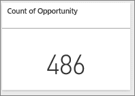
Cards
There are times when charts and dashboards can be overwhelming, or you don’t have the time to look at graphs or charts to gain the insight you require. A card visualisation simplifies things and displays them as a single number. Cards enable real-time figures to be accessed quickly and easily, ensuring important decisions can be made whenever needed. Examples of metrics that can be tracked on cards are profit made, total sales and opportunity count. Additionally, if one card isn’t enough multi-row cards are also available.
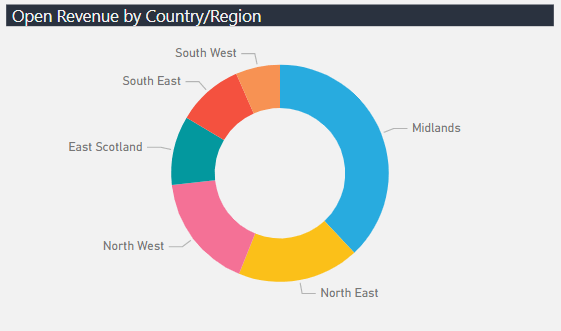
Doughnut Charts
Doughnut charts are like pie charts; it shows the relationships as parts of a whole. The main difference is that the centre of the doughnut chart is left blank to allow for a logo, icon or label. They are best suited when making comparisons between categories.
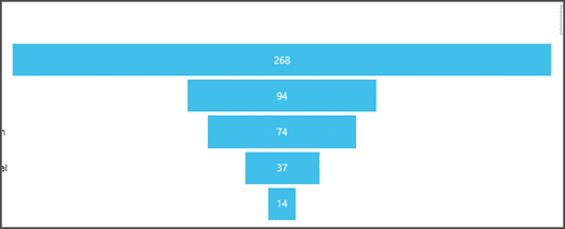
Funnel Charts
A funnel chart helps you visualise a linear process that has sequential connected stages. For example, a sales funnel that tracks customers through stages: Lead > Qualified Lead > Prospect > Contract > Close. The benefit of this chart is this allows you to view each stage individually and identify any areas that are falling behind or not performing as you would expect.
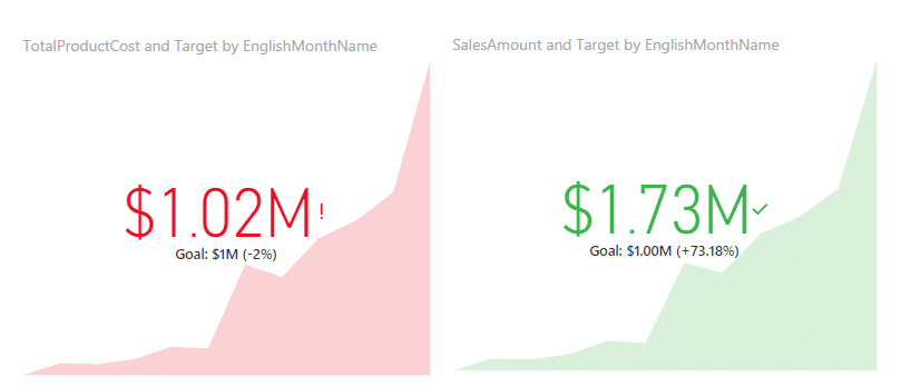
KPIs
Using the KPI visualisation allows you to track real-time progress made towards a measurable goal. You can quickly analyse if you are ahead or behind on achieving a goal and assess/measure the distance or time needed to achieve it.
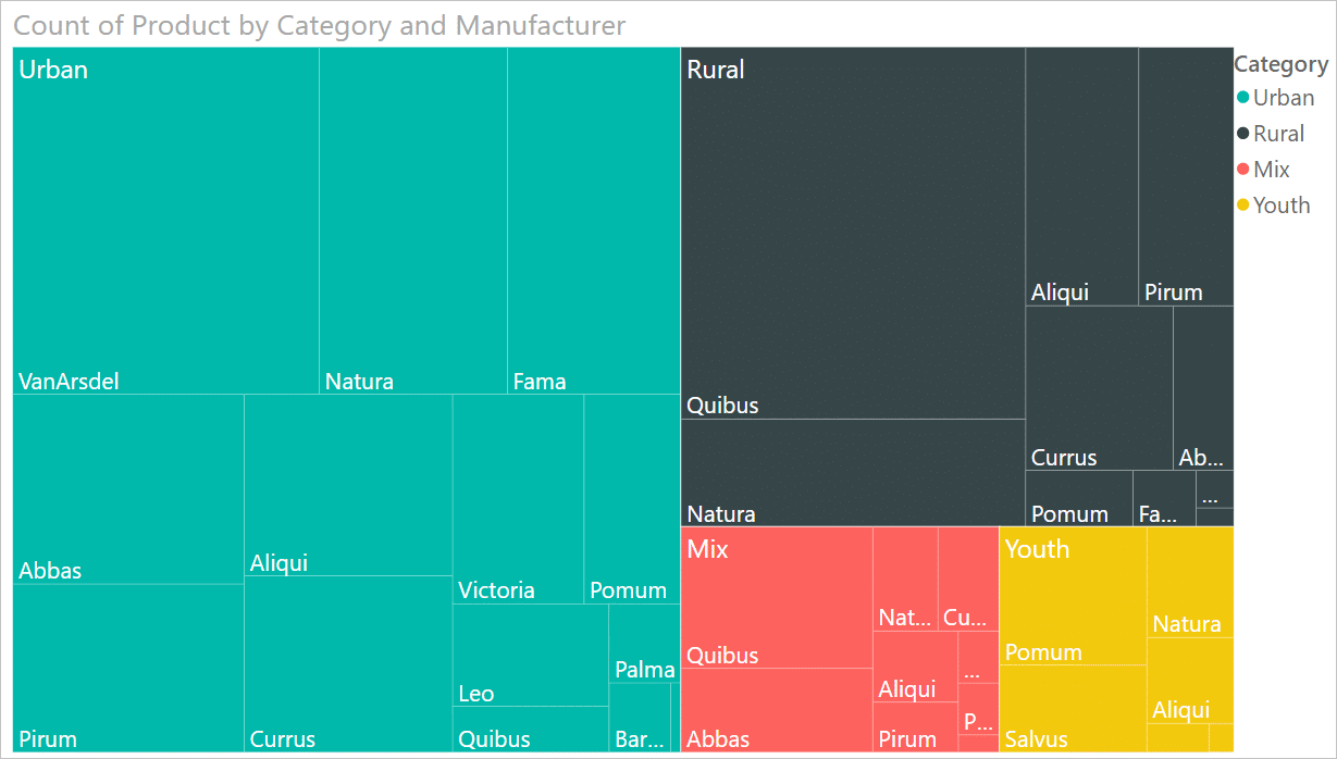
Treemaps
Tree maps display hierarchical data within a nested rectangle. Each level of the hierarchy is represented by a coloured rectangle (branch) containing smaller rectangles (leaves). Power BI bases the size of the space inside each rectangle on the measured value. The rectangles are arranged in size from top left (largest) to bottom right (smallest).
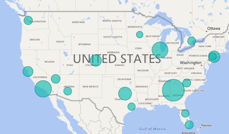
Maps
There are a range of map visualisations available within Power BI. The most common types of map are ‘Bubble Map’, ‘Filled Map’ and ‘Shape Map’, all of which are power by Bing Maps.
Bubble Map
The bubble map will place a circle on top of each location. The bubbles will be different sizes based on the Size field, but there is not a huge difference between the biggest and smallest bubble. The main benefit is by hovering over each data point and looking at the tooltip.
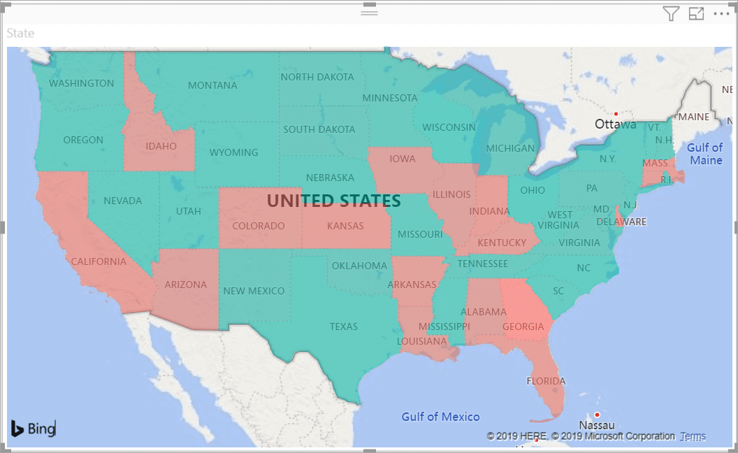
Filled Map
A filled map uses shading or tinting or patterns to display how a value differs in proportion across a geography or region. Shading ranges from light (less-frequent/lower) to dark (more-frequent/more), to display the relative differences.
Shape Map
Shape maps cannot show precise geographical locations of data points on a map. The main purpose of this visual is to show relative comparisons of regions on a map by colouring them differently.
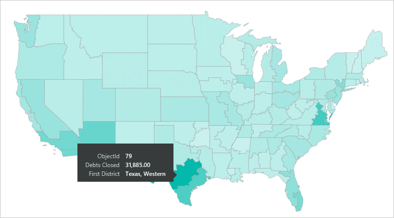
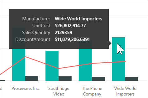
Tooltip Functionality
Tooltips are an elegant way of providing more contextual information and detail to data points on a visual. This feature enables you to hover over a visual within a report and quickly gain a deeper insight, eliminating the need to leave the report and click into data fully. The following images show a tooltip applied to a visualisation in Power BI Desktop.
Get in touch
There are more visualisations available in Power BI and you can find a full list on the Microsoft website. Hopefully, by looking at the popular visualisations listed in this article, you now have a better understanding of what Power BI is capable of and the powerful functionality available within this tool.
As a Microsoft Partner, we implement Power BI across the majority of our projects to help our clients gain clarity around reporting and uncover actionable insights from their data. If you would like more information, please get in touch via the contact form, or email us at info@pragmatiq.co.uk / call us on 01908 038110.
Want to keep in touch?
Sign up to our newsletter for regular updates.
"*" indicates required fields